About the Client
Aegora is a trusted private network connecting people, capital, and gaming destinations around the world. We worked directly with the Aegora founding team to build the brand from the ground up. The platform is built for hosts who want to bring their circle into the world's most powerful gaming destinations, with recognition already in place before they arrive. At the time of engagement, Aegora had live partnerships with Inspire Korea, Paradise Group, and Dream Tower Jeju, with access across major Asian VIP gaming hubs, but no brand, narrative, or product identity to match.
Challenge
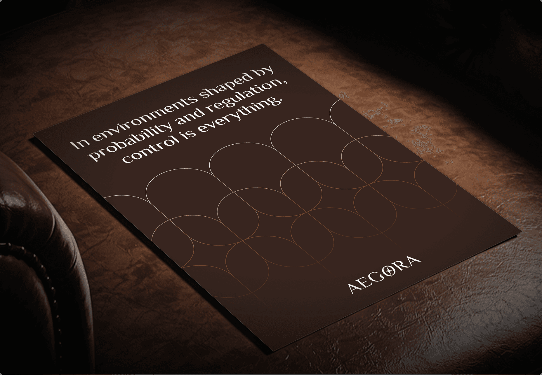
Develop a brand identity for a private network that could serve high-net-worth players in private gaming while feeling institutional and discreet rather than promotional.
In 3 months, LKI built Aegora's entire brand presence from scratch - name, strategy, narrative, visual identity, website, and app UX/UI, positioning the client as a trusted private network for crypto-native HNWIs across major Asian VIP gaming destinations. The full brand system was developed across ten steps, covering every touchpoint from institutional pitch materials to product design, with distinct positioning frameworks developed for four audience segments.
We built the entire brand in eight focused steps.
1. User interviews
Before writing a single word of strategy, we conducted interviews with three senior stakeholders to surface consistent themes, contradictions, and unexpected insights. The interviews covered three areas:
Who is the ICP - players and agents?
What is the value proposition?
Where is the competitive gap?
2. Strategy
Competitor mapping revealed a clear structural gap. Online crypto casinos operate at scale but lack mechanisms to attract HNWIs. Traditional casinos rely on junkets - private managers with access to VIP players- to drive revenue at physical locations. Neither model targeted the crypto-native high-net-worth individual who wants to experience luxury gaming in person but comes from the digital-first world of Web3. That gap became Aegora's competitive position.

3. Naming
The name Aegora was engineered from two classical Greek roots: Aegis - the protective force carried by Zeus and Athena, used to denote sanctioned authority and institutional oversight. While Agora, the structured civic and commercial center of the ancient Greek polis, where only recognized participants operated and capital moved alongside influence. Fused into a single word that exists in no language, Aegora is original, trademarkable with zero global conflict, and structurally describes what the business does. Three syllables (Ae·go·ra), stress on the first, consistent with classical institutional cadence.
4. Narrative & Positioning
The master story was built around one central metaphor: the private network. The core narrative frames Aegora as a map of the world's leading gaming destinations; what appears as scattered access points reveals itself as a coordinated network. This supported the mission (to map the world's leading gaming destinations into one trusted private network), the vision (to give the next generation a new way to enter, experience, and move through the world of gaming), and the tagline: Aegora - a trusted private network that moves for you.
We developed distinct positioning for four audience segments - crypto HNIs and family offices, high-frequency crypto traders, Web3 founders and project owners, and Web3 network operators acting as agents, each anchored to a separate story pillar and key message derived from the core narrative.
5. Logo development
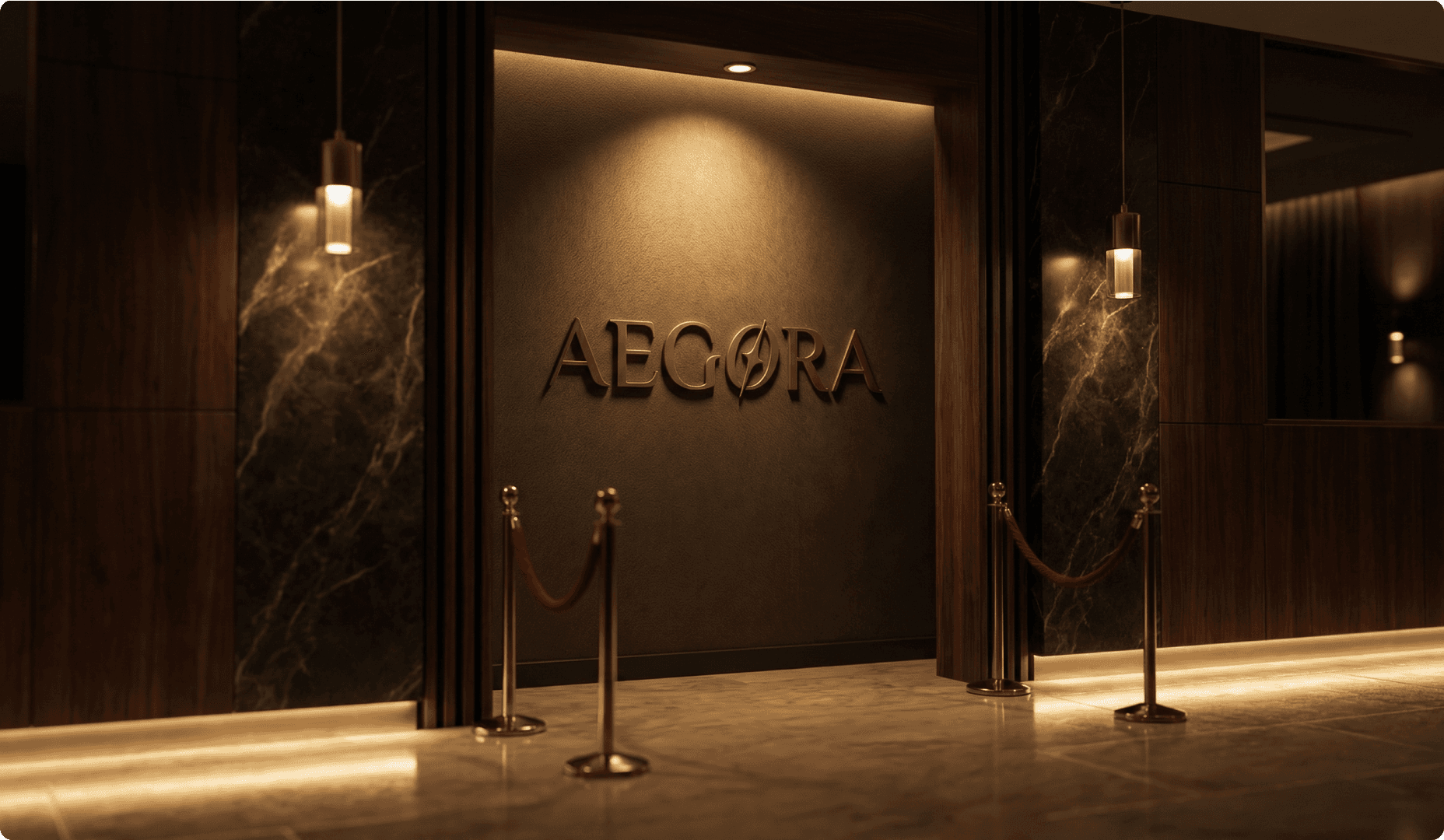
We crafted a combination mark where every element signals institutional credibility. The serif typeface was a deliberate choice against the market, every crypto brand in this space runs sans-serif; Aegora goes the opposite direction, toward permanence and a visual language that reads as established. A compass navigating mark is integrated directly into the "O" letterform, reflecting how Aegora operates as the layer behind every host's movement across destinations. Character tracking is set wider than market standard, treating space as a luxury. A four-pointed star inside the compass references the North Star - one fixed point of recognition for hosts across all destinations.
6. Visual identity creation
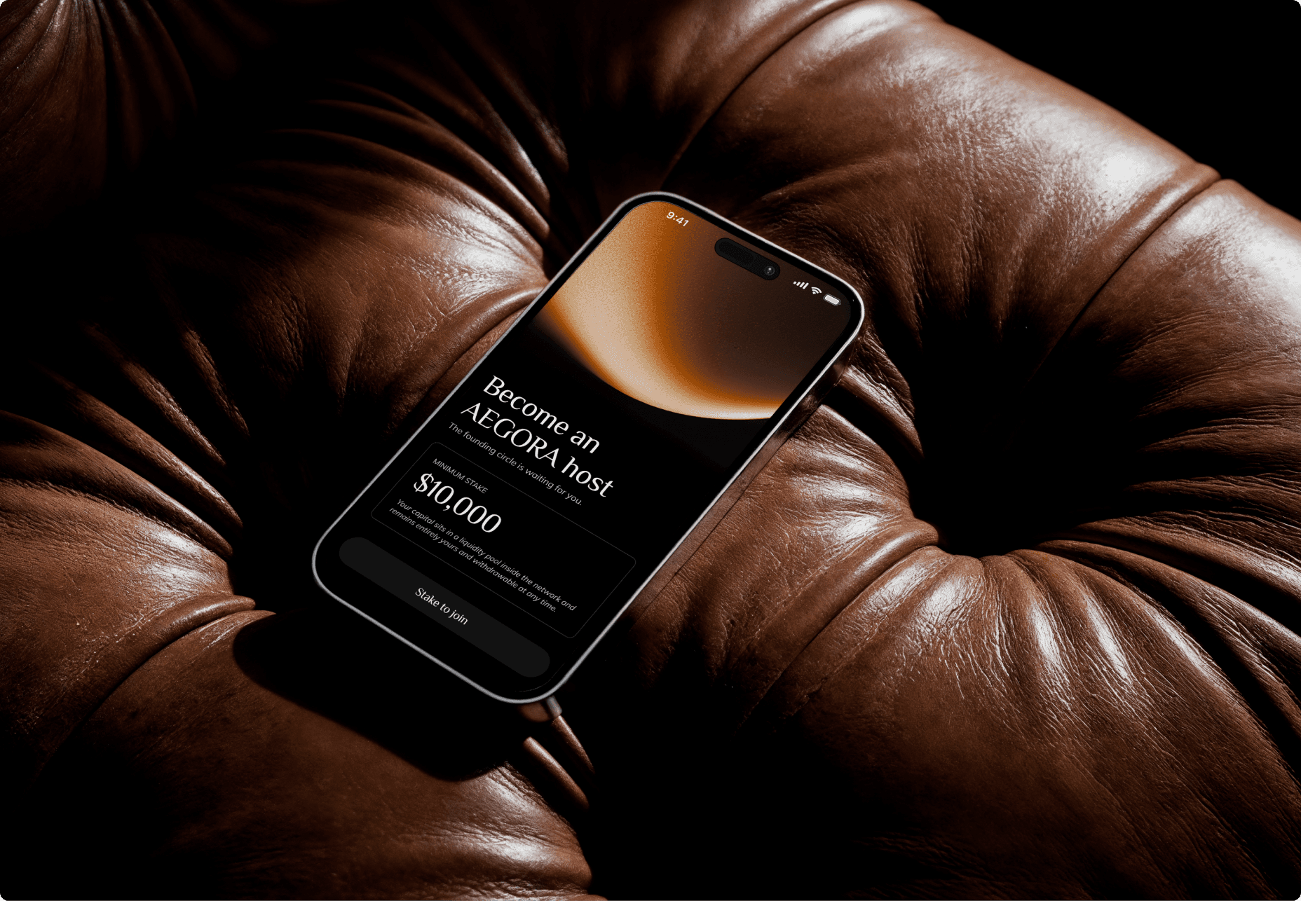
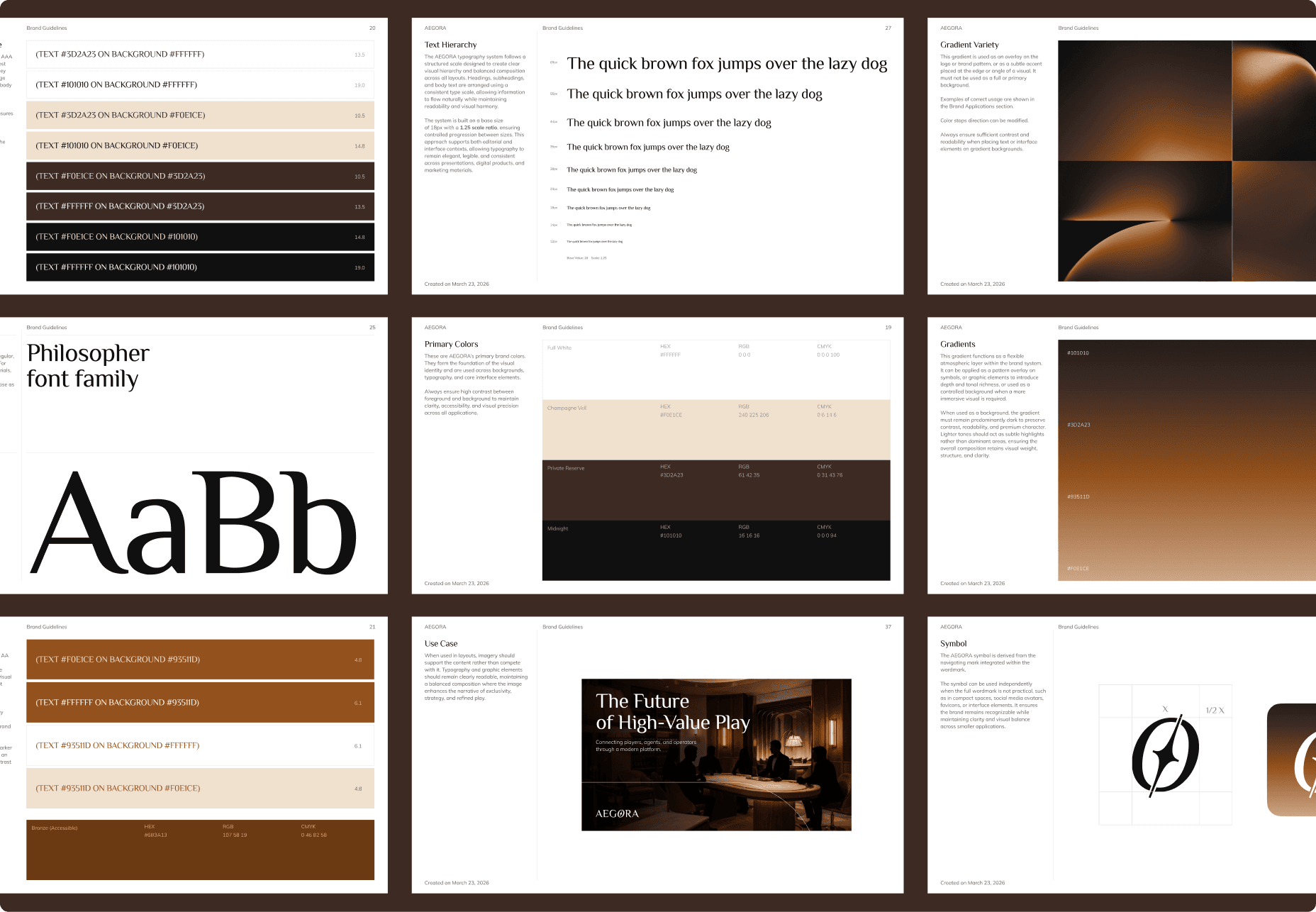
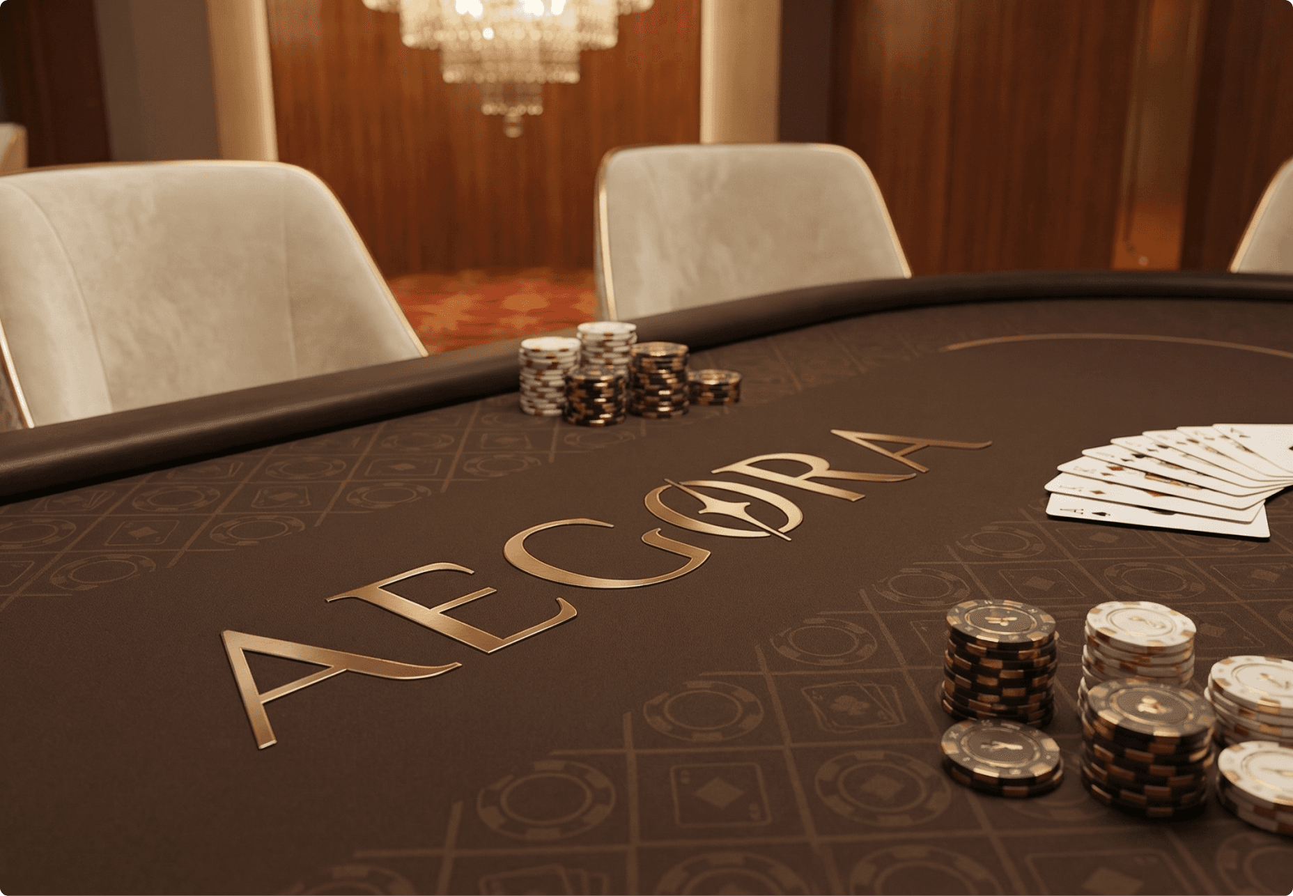
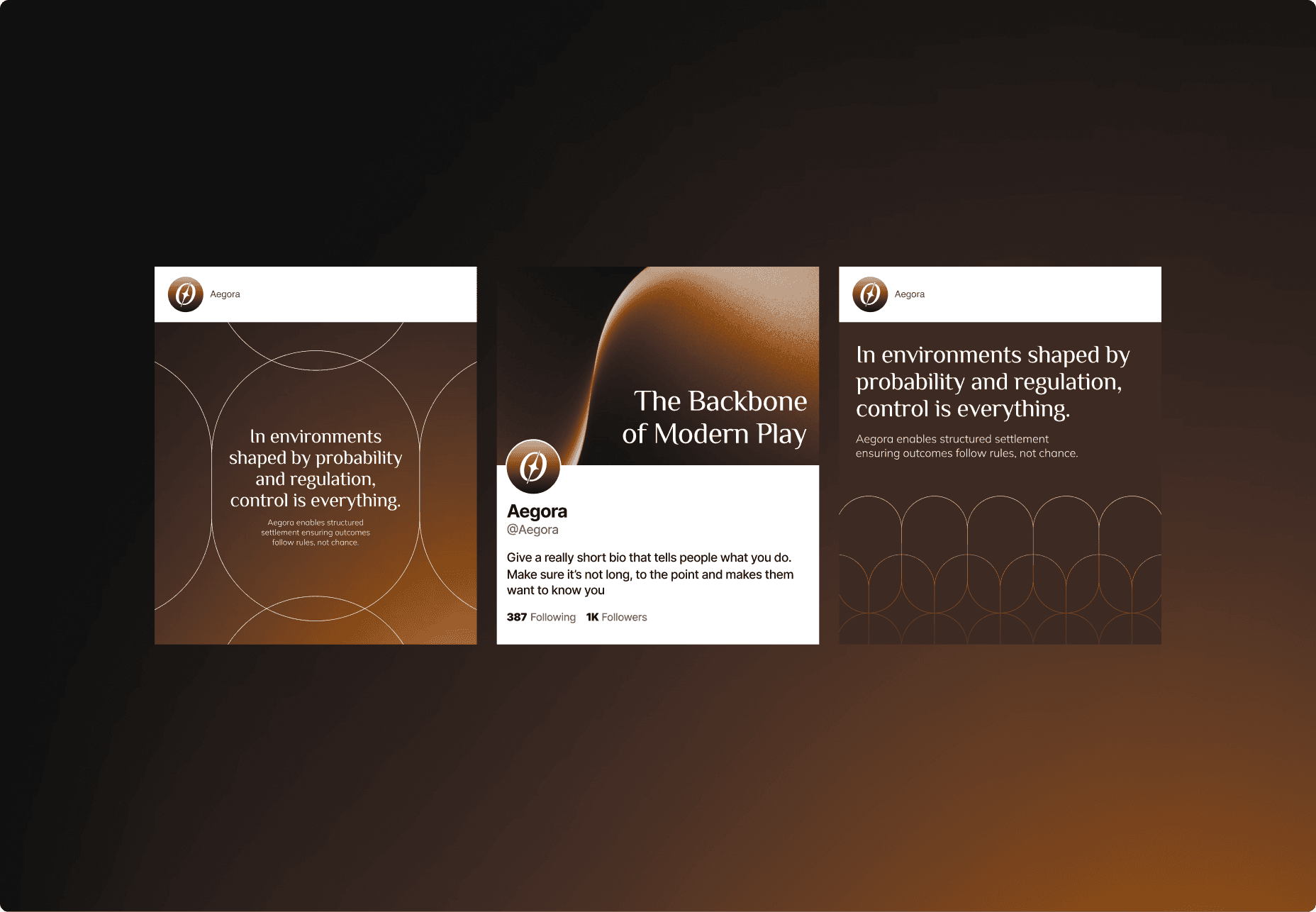
The visual system is built around warmth, precision, and controlled luxury. Deep blacks, warm amber gradients, and wide-spaced serif typography signal old-money confidence in a crypto-native format.
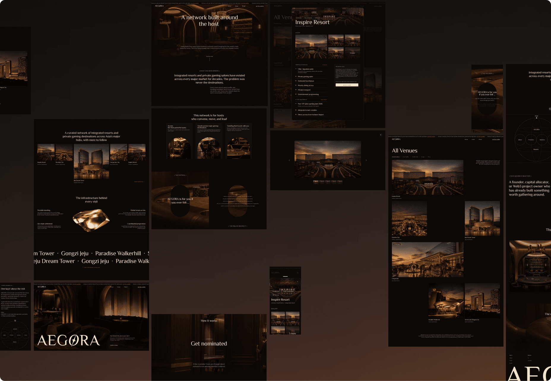
7. Website design
Full website design delivered across homepage, about, and contact screens.
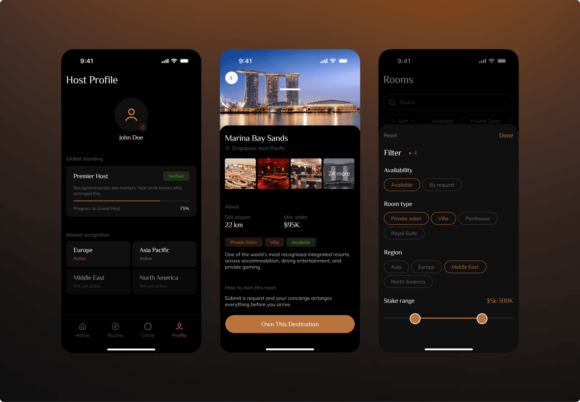
8. UX/UI design for app
Product design delivered across the core app screens including home, player profile and dashboard, and destination browser. Before moving into visual execution, we mapped out full wireframes and user workflows for every screen in the app, defining how hosts and guests would move through the experience from arrival to destination access.