Challenge
Develop a brand identity for an early-stage VC fund founded by operators from JPMorgan and Gate.com that could win pre-seed and seed deals against category leaders despite having no name or market presence.
In under two months, LKI built ALPS Capital's entire brand presence from scratch, positioning, naming, logo, visual identity and investor pitch deck, taking the fund from a strong thesis with no public presence to a fully formed visual identity ready to compete for pre-seed and seed deals. The brand system was developed across four stages, from the positioning to the final pitch deck used for capital formation.
About the client
ALPS Capital is an early-stage venture fund backing financial market infrastructure for institutional adoption of digital assets and artificial intelligence. It is led by operators with backgrounds at JPMorgan and Gate.com. The fund invests at the pre-seed and seed stage and works with advisors from BlackRock, Citi, and Tradeweb.
The fund was already in motion when it came to LKI, backed by a clear thesis and an experienced team, but without a name, a visual identity, or materials to bring into fundraising and founder conversations. LKI built all three from scratch, giving ALPS Capital a complete identity to launch with.
We executed the brand build in four stages.
Stage 1. Positioning
ALPS Capital needed an edge that would set it apart from other funds while reading as both institutional and forward-looking - a combination most financial brands avoid by choosing one side or the other. That edge was found in positioning the firm as a VC focused on financial markets infrastructure and artificial intelligence. The GPs’ thesis was straightforward: institutions are coming on-chain, and the transition will require specialized companies that build the technical infrastructure to support it. Most funds in this space fall into two camps - traditional finance brands that feel safe but dated, or crypto-native brands that feel current but speculative. ALPS Capital sat between both and fit neither. The gap between old finance and new finance became the space the identity was built to fill, signaling the stability limited partners and founders require rather than the speculation they already distrust.
Stage 2. Naming and logo development
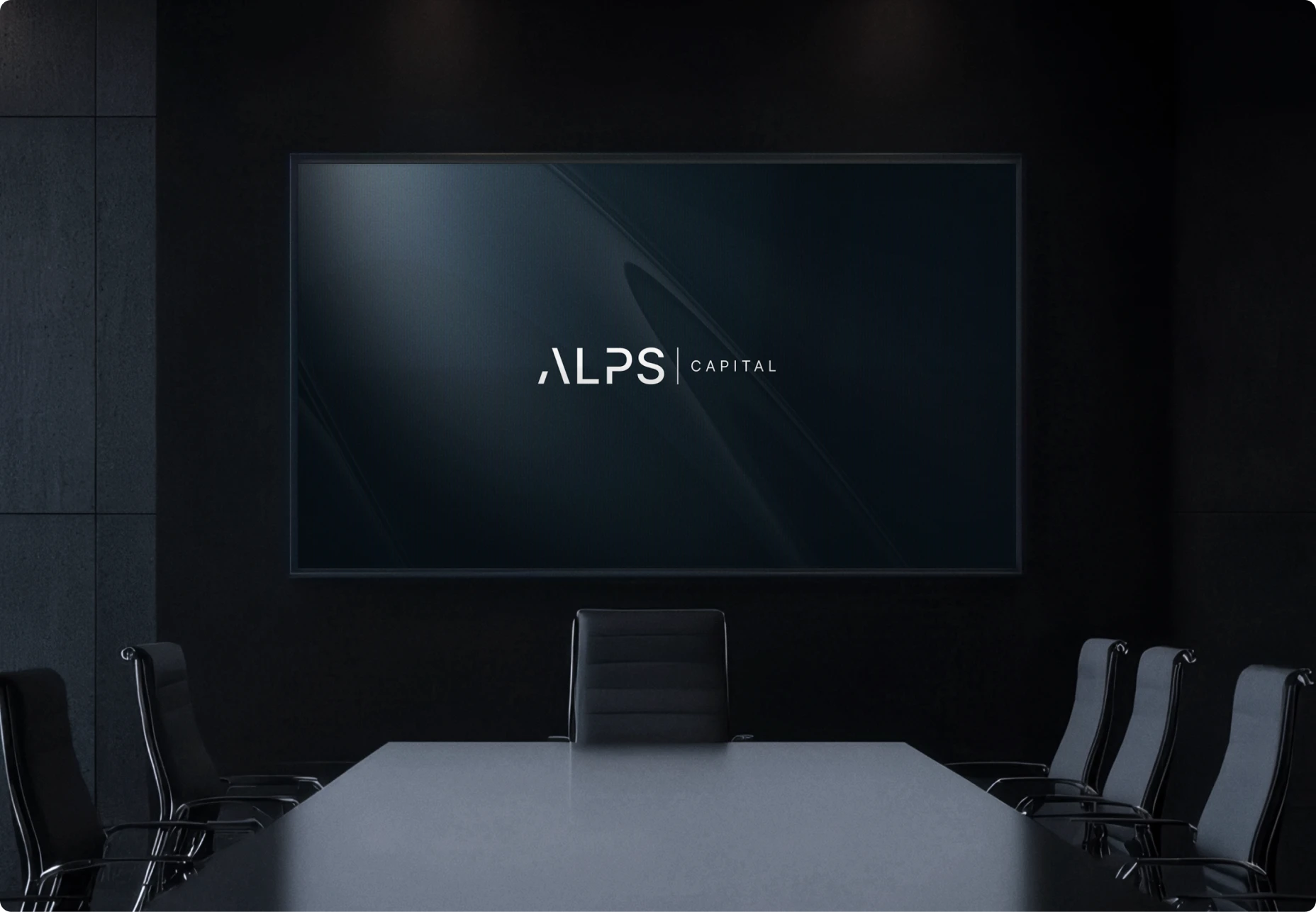
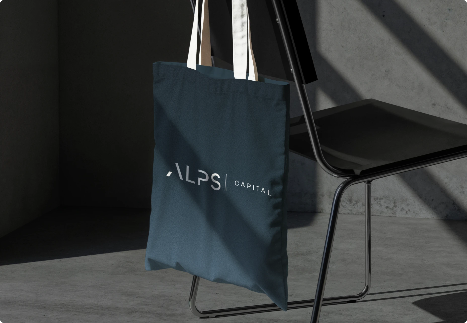
The name ALPS Capital was set to carry the same duality as the positioning: the Alps are a fixed, permanent range that founders and institutions have relied on for centuries, a reference point rather than a trend. Pairing that with "Capital" grounded the name in finance rather than leaving it as an abstract geography reference. The wordmark was built around the letters "A L P S" in bold sans serif, paired with "CAPITAL" in a smaller, letter-spaced weight and separated by a thin vertical rule, a construction that mirrors how institutional names are read: the identity first, the function second. The A carries no crossbar, so its open apex doubles as a mountain peak without becoming a literal illustration, letting the logo carry the metaphor without needing to explain it. A standalone icon version of the mark was built for favicons, app icons and social avatars, alongside a stacked lockup for formats where horizontal space is limited.
Stage 3. Visual identity
The visual system was built to carry the same institutional and forward-looking duality as the positioning and logo, using color, typography and imagery as extensions of that idea.
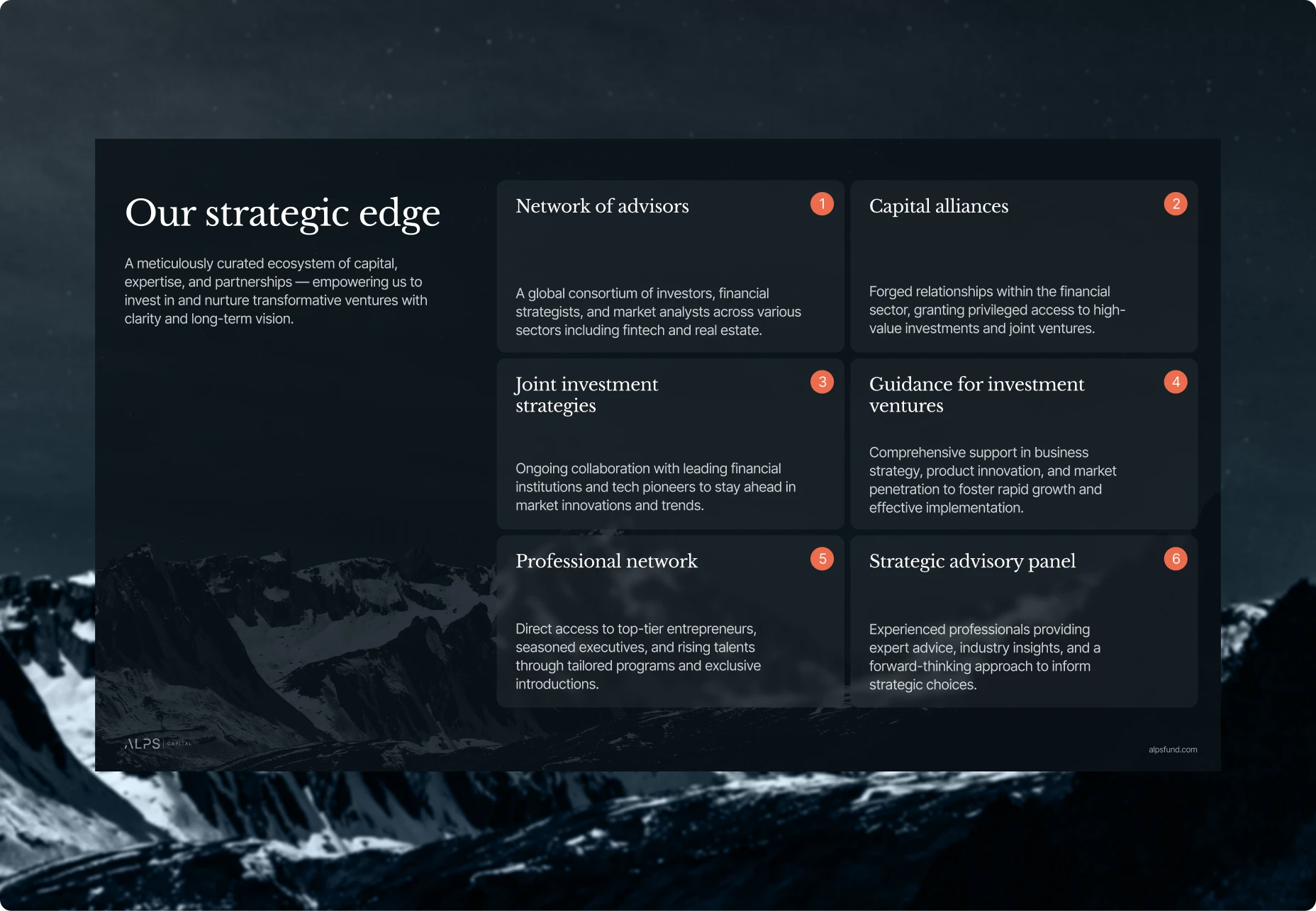
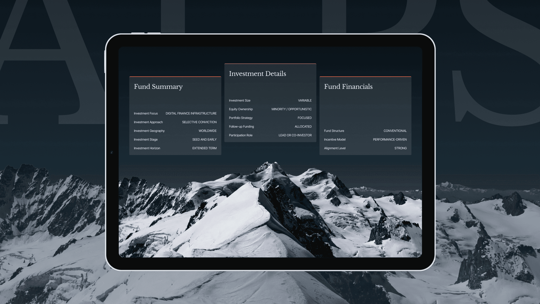
Color palette: near black and charcoal grounds, Midnight Peak and Deep Ridge, with a cool slate blue, Glacier Slate, and a soft neutral, Alpine Mist, for structure. A single warm orange rust accent, Alpenglow, is reserved for underlines, numbered badges and callouts, and kept out of gradients so it stays a rare highlight.
Typography: Libre Baskerville, a serif, set for headlines and pull quotes, carrying the institutional register the fund needed. Inter, a sans, set for labels, data points, and interface-style content, tracked out in uppercase to read as technical and precise.
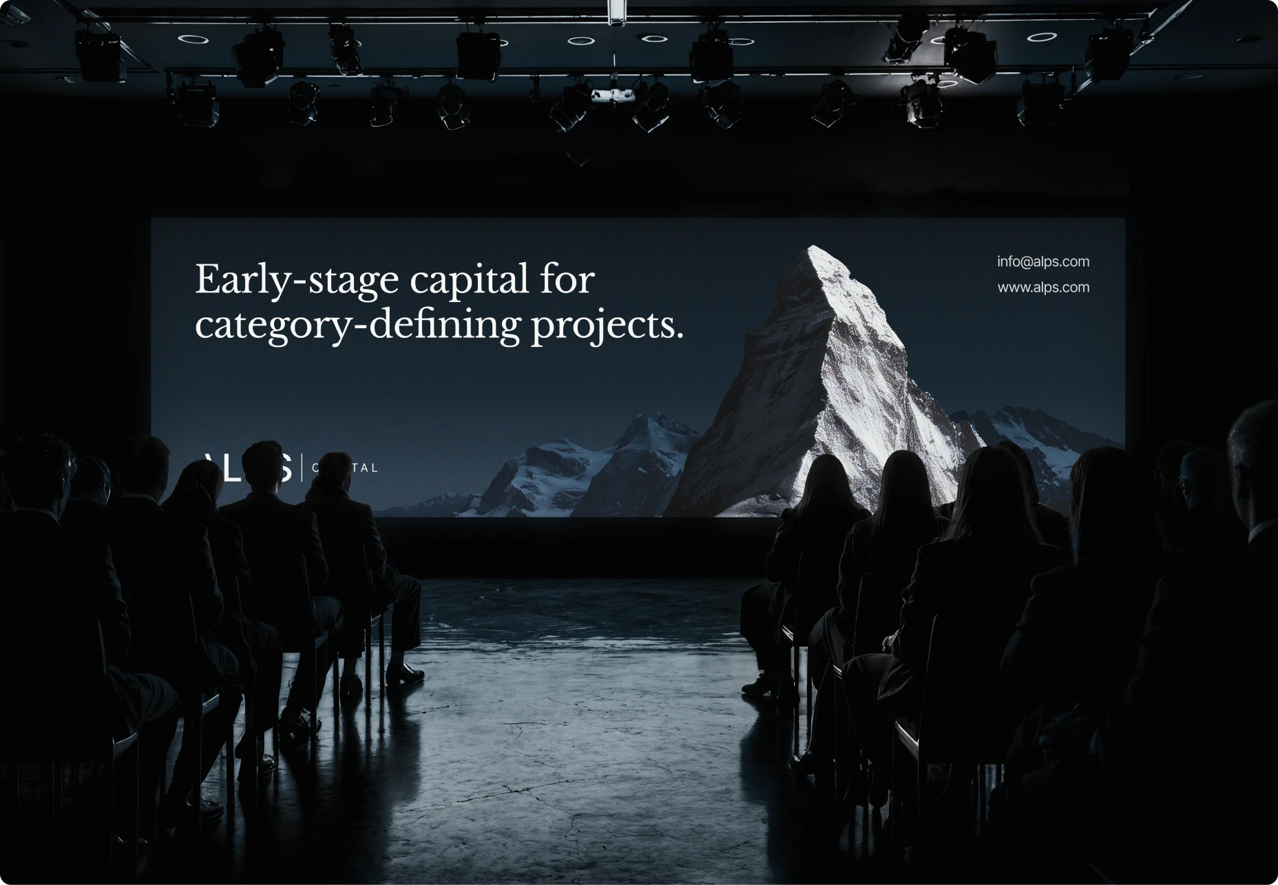
Imagery: desaturated photography of peaks and glaciers on dark slides, paired with abstract gradient light streak graphics that echo ridgelines across the deck.
Stage 4. Pitch deck
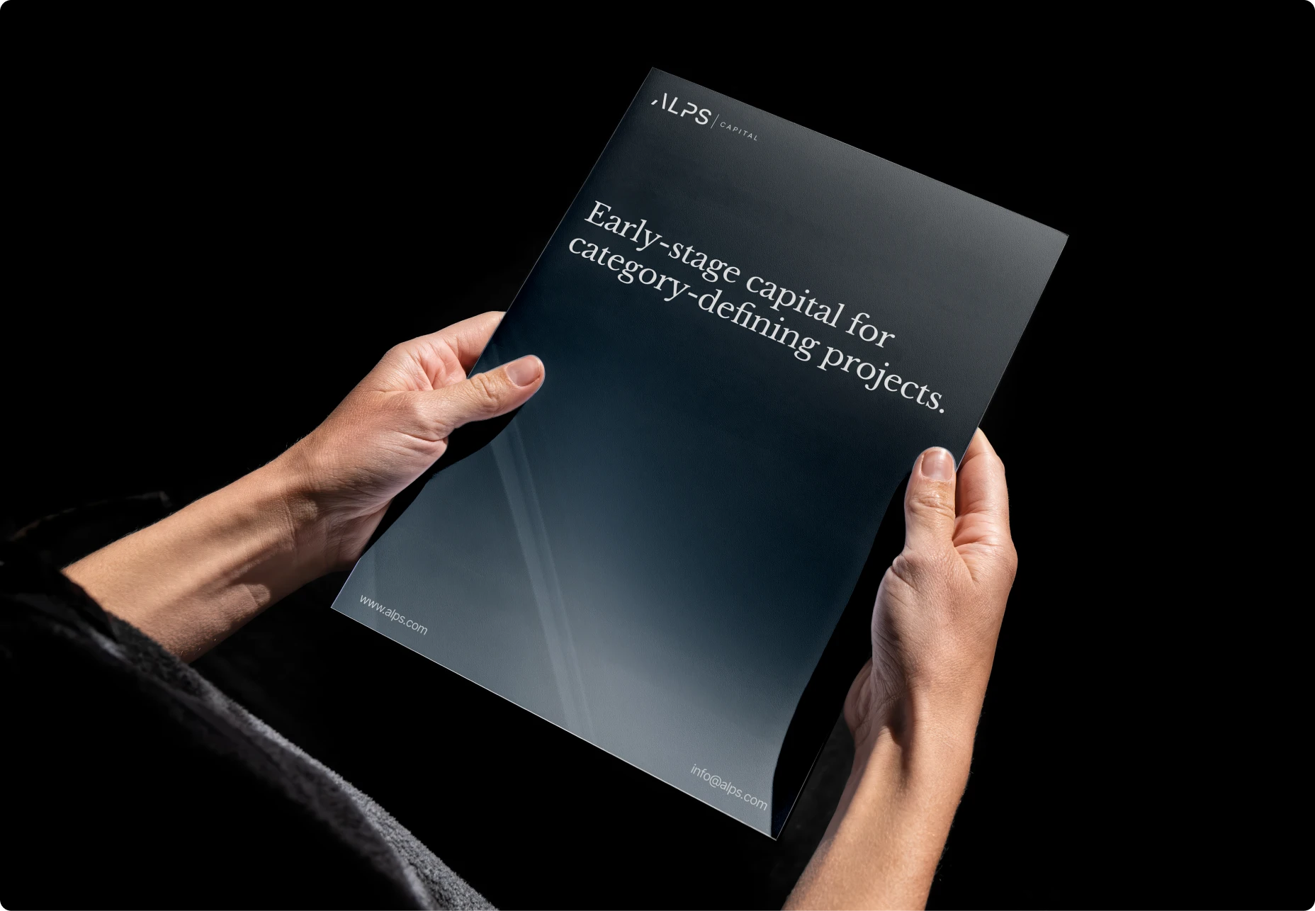
The visual identity was then built out into a full investor pitch deck, structured to hold the fund's thesis, market opportunity, and team credibility within a single consistent visual grammar. The deck gave ALPS Capital a working tool for fundraising and deal conversations from launch, with every section reading as part of the same institutional identity.