About the Client
Peanut is a full-cycle market maker that has been active since 2020, specializing in DEX launches and token generation events. We worked with their core market-making business, which at the time of engagement held a Top-3 DEX market maker position and served 1,000+ retail B2C projects. As the market shifted away from meme launches, Peanut needed to access institutional clients without disrupting its existing retail operation.
Challenge
Peanut had strong brand recognition and 1,000+ retail clients as a full-cycle DEX market maker, but its meme-friendly identity was not well-suited to capture the institutional market it needed to reach as the retail landscape shifted.
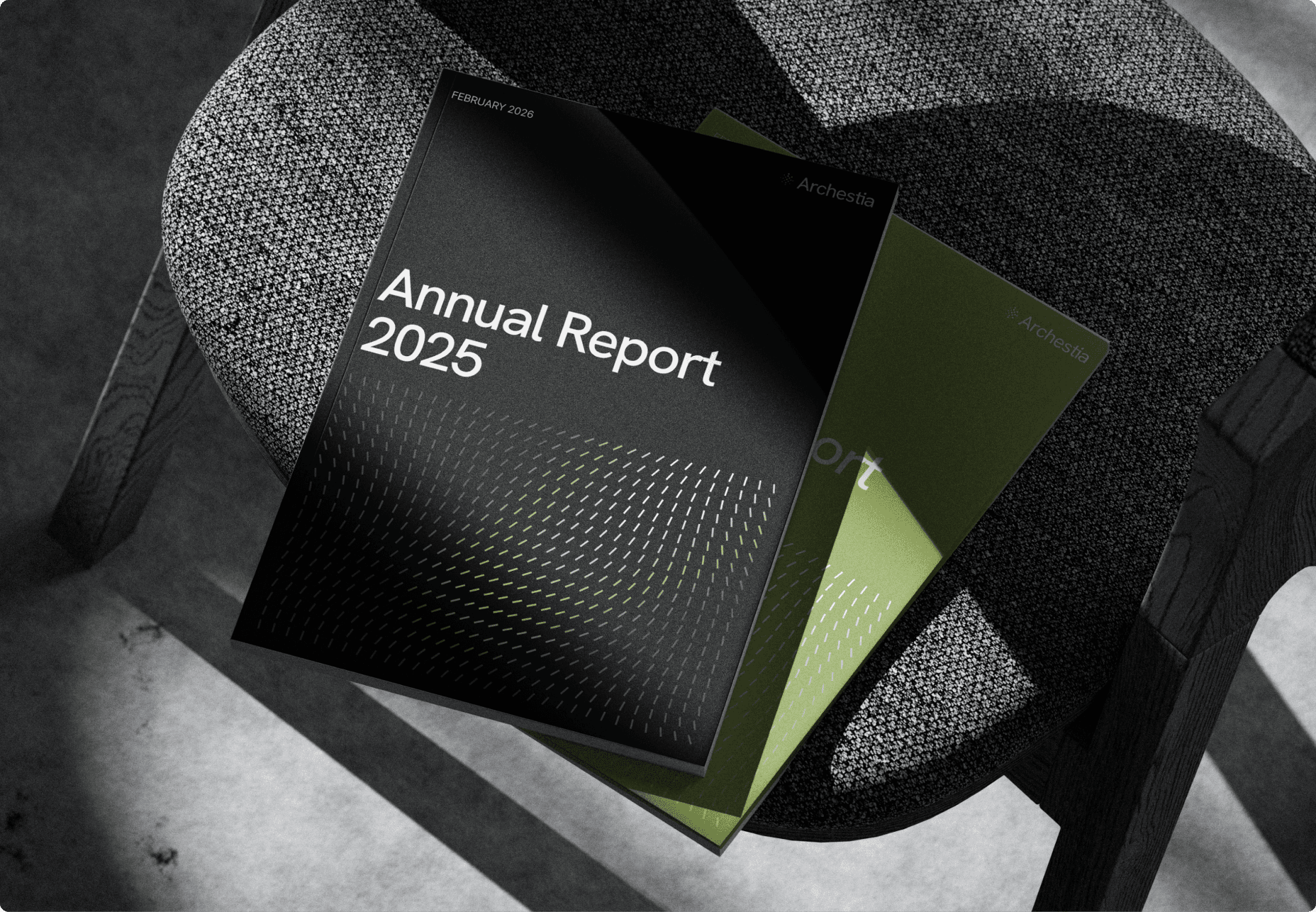
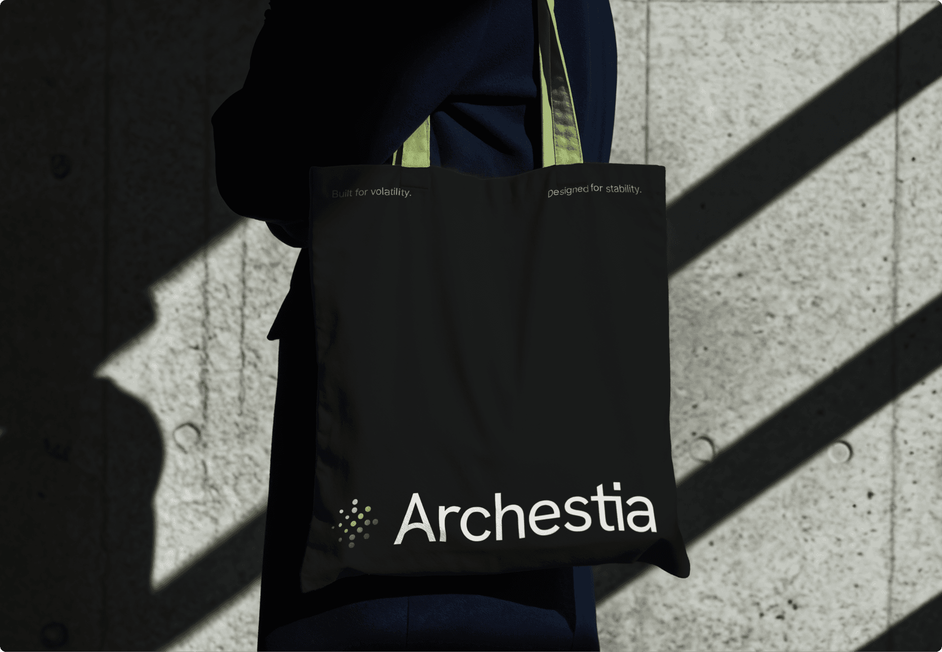
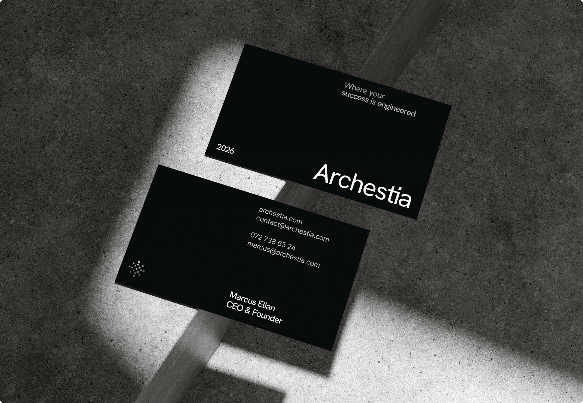
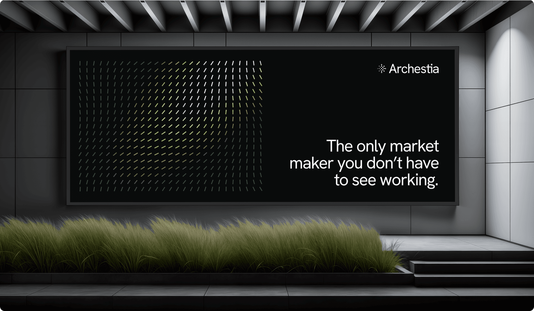
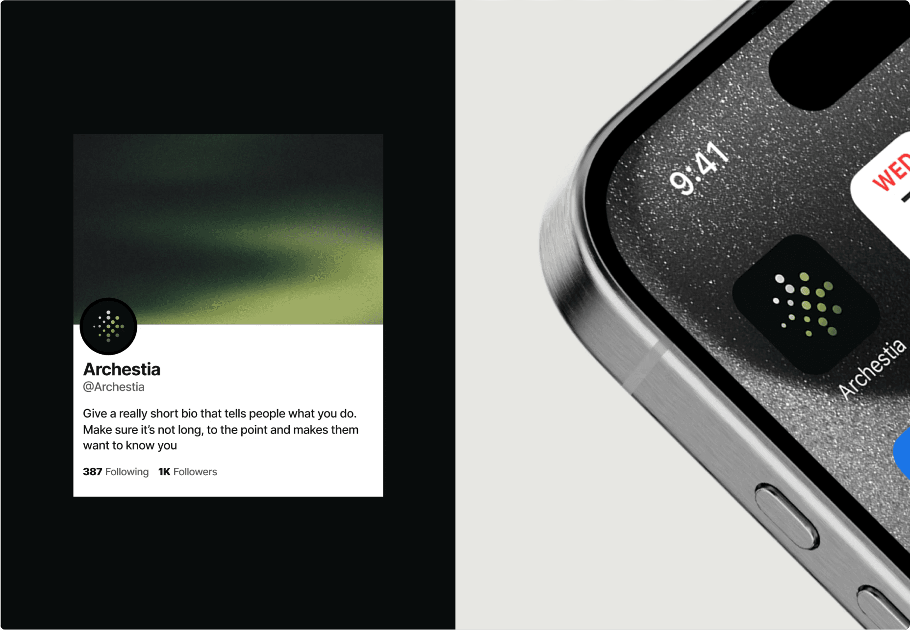
In 3 months, LKI developed a fully separate institutional brand - Archestia - for Peanut, taking the client from a retail-facing, cartoon-branded market maker to an institutional-grade liquidity provider with a distinct name, positioning, narrative, and visual identity. The rebrand covered the full brand stack, from strategy and naming through to logo, visual system, and brand applications across multiple touchpoints.
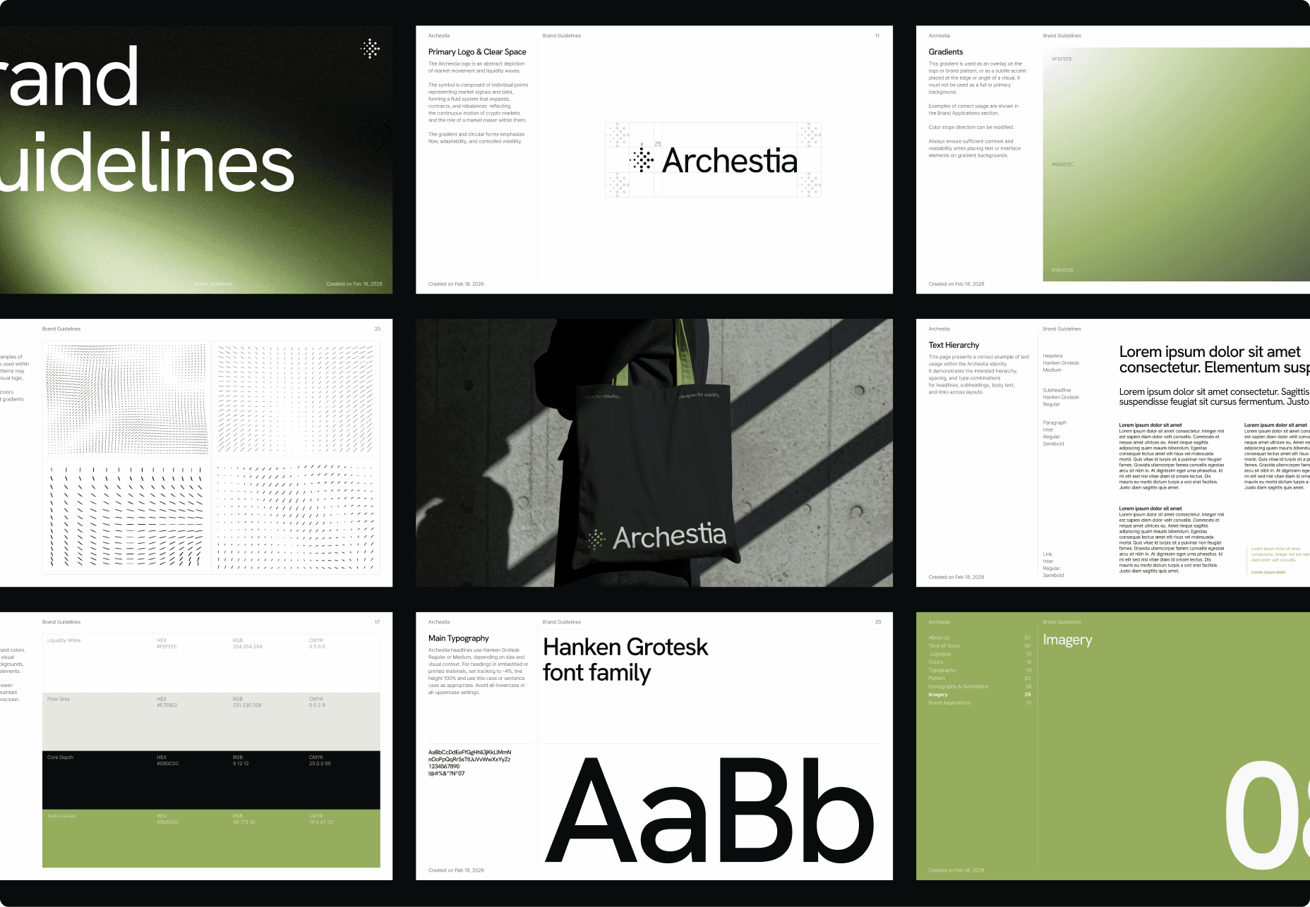
We executed the rebrand in six focused steps.
1. User interviews
Before writing a single word of strategy, we conducted a mix of structured and unstructured interviews with those who knew Peanut best. The interviews covered four areas: who the ideal institutional client actually is, what sets Peanut apart in a market where every market maker claims the same edge, how the existing brand was being perceived, and where the long-term opportunity lay.
2. Strategy
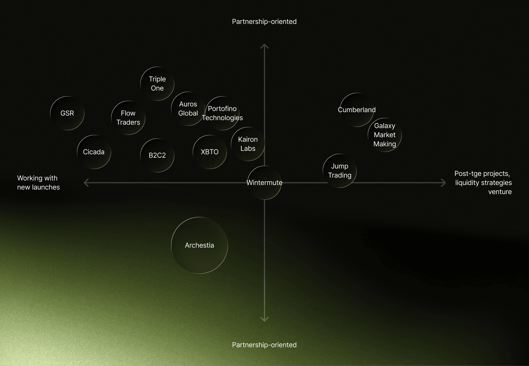
Competitor mapping showed that most institutional-grade market makers come from CeFi and TradFi - execution-focused and oriented toward new launches. No player had claimed the middle ground: institutional-grade but partnership-oriented. That gap became the strategic foundation for the new brand.
3. Naming
The new brand name - Archestia - was built around the metaphor of an orchestra: many moving parts working in rhythm to produce a coordinated outcome. The prefix "arch" echoes the idea of architecting systems, aligning with the brand's role in designing market environments. The three-part rhythm (Ar-ches-tia) makes it easy to pronounce while retaining a premium feel.
4. Narrative & Positioning
The master narrative was built around a central metaphor: markets behave like music. The role of a market maker is not to dominate the stage but to maintain rhythm, absorb volatility, and ensure every participant plays in time.
From there, we developed distinct positioning for four audience segments - projects approaching TGE, post-launch CMC Top 300 projects, institutional funds and family offices, and pre-TGE projects in active fundraising - each anchored to a different angle derived from the core narrative.
5. Logo development
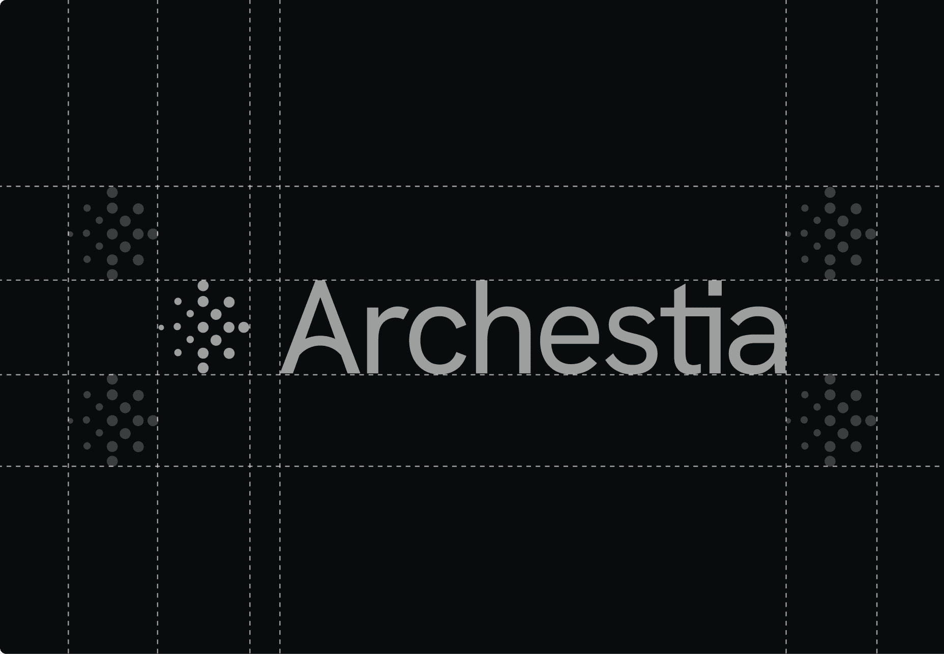
We designed a combination mark pairing bold typography with a circular point symbol. The symbol represents multiple market signals working together - traders, liquidity, and capital flows orchestrated as one coordinated system.
6. Visual identity creation
The Archestia visual identity is built around the concept of gravity - a silent force that bends flows and shapes outcomes. The signature pattern uses repeating linear elements in gentle curves to suggest liquidity waves and shifting momentum, remaining secondary to the logo and typography.