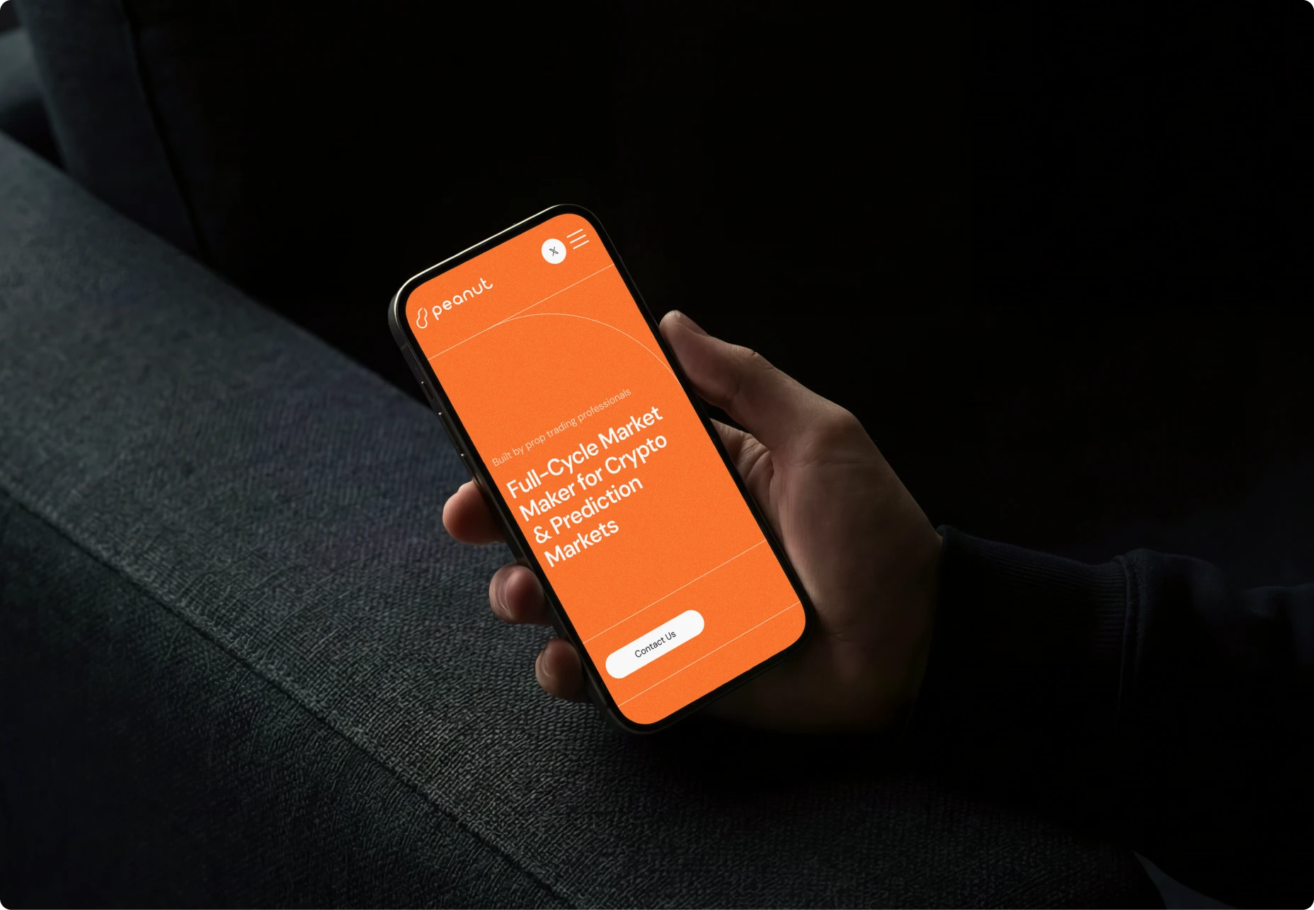
Challenge
Peanut's website carried the visual habits of a crypto brand serving meme projects, with scattered illustration and inconsistent layout, and did not reflect its position as a Top-3 DEX market maker serving established Web3 businesses.
About the Client
Peanut is a full-cycle market maker active since 2020, specialising in DEX launches and token generation events. At the time of engagement, Peanut held a Top-3 DEX market maker position and served over 1,000 B2C projects.
Goals
Primary: Rebuild the website into a grid-based, modular system that reflects Peanut's scale and maturity as a market maker.
Supporting: Retain Peanut's brand warmth (orange accent, mascot) while removing the elements that worked against credibility with more serious visitors.
Solution
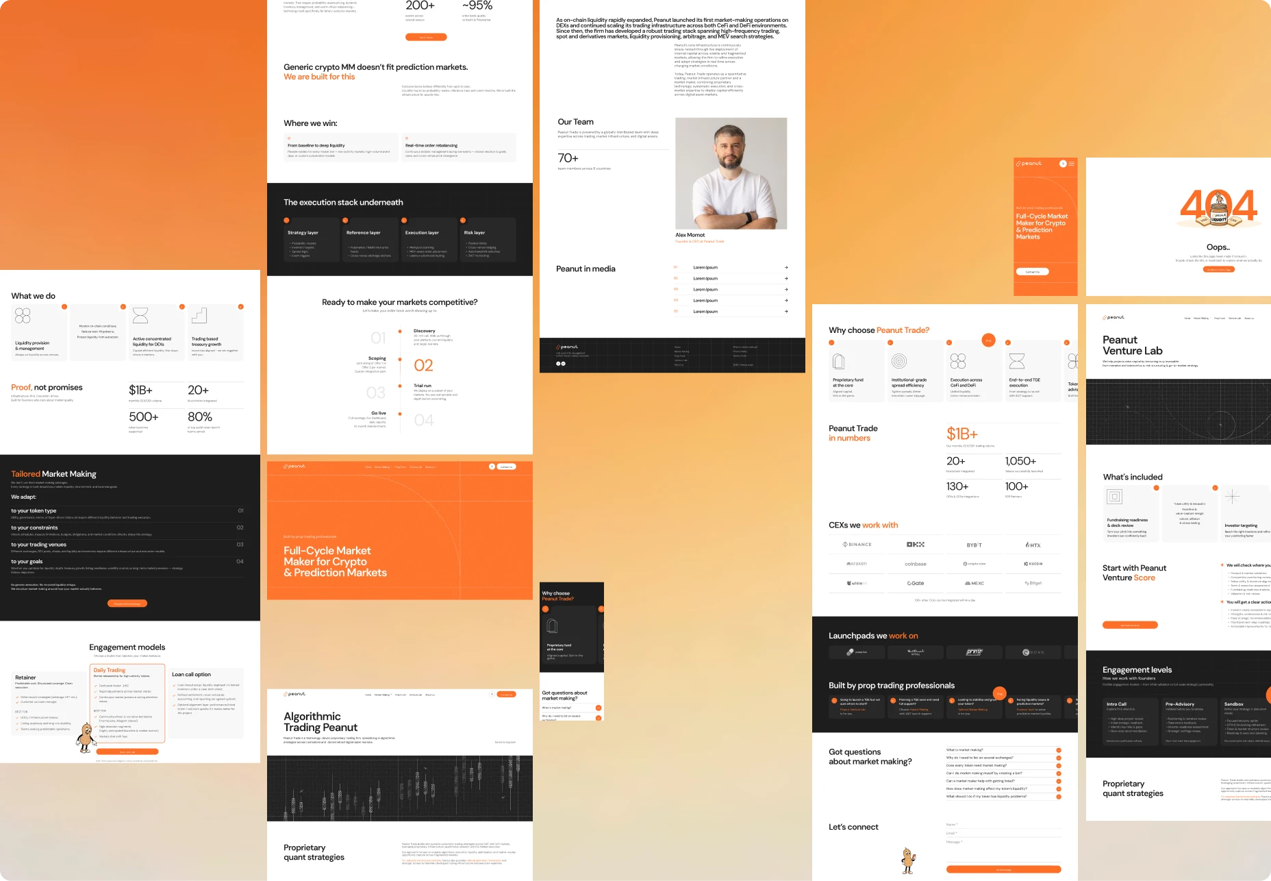
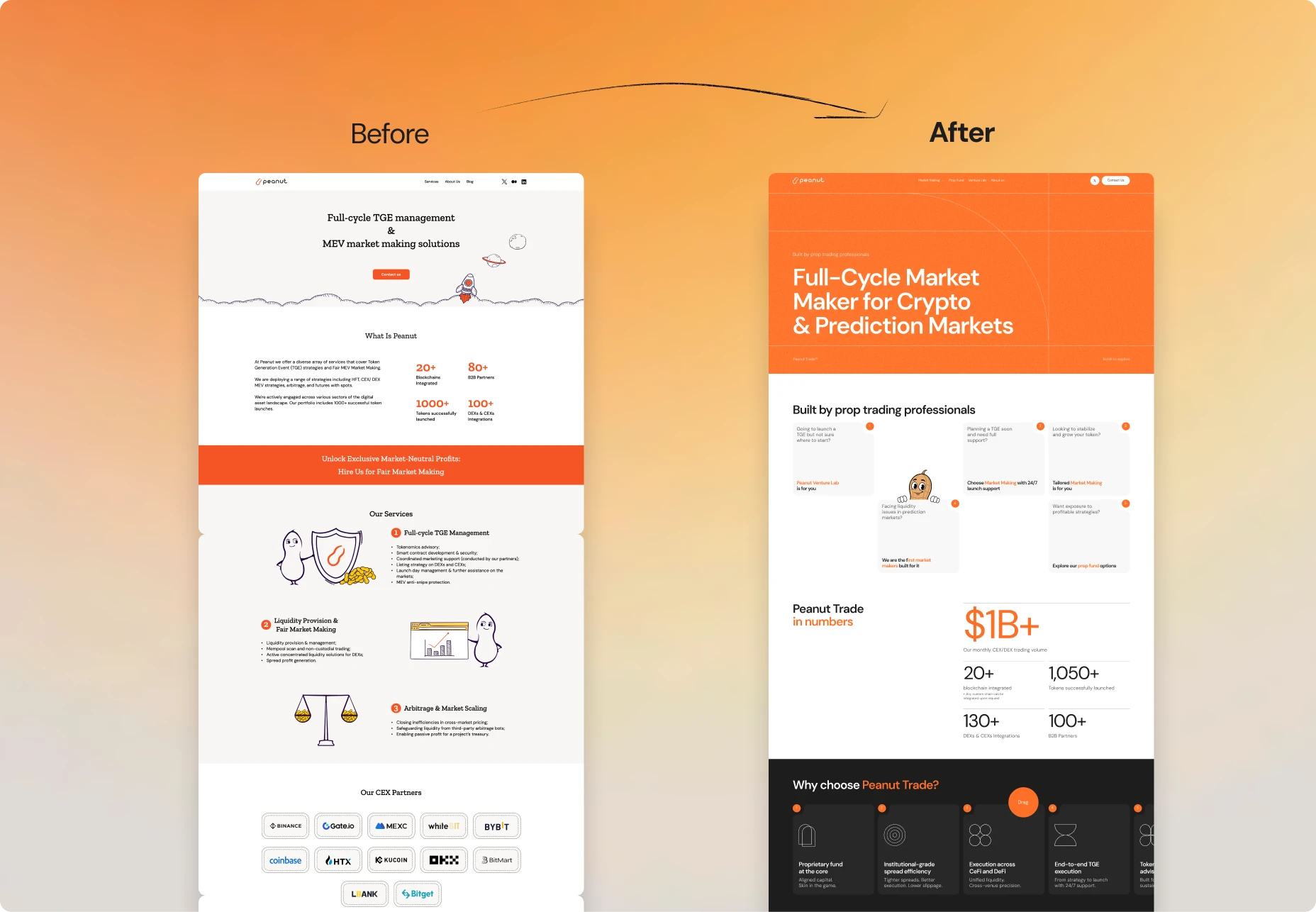
LKI redesigned the Peanut website, moving from a templated, illustration-heavy layout to a structured, grid-based system that reflects the scale of a Top-3 DEX market maker.
Website redesign
The previous site relied on scattered emoji, heavy illustration, and a mascot appearing at nearly every section, which gave it a template feel closer to an early-stage crypto project than a business with Peanut's track record. The redesign kept enough of that original warmth, the orange accent and the mascot, to stay recognisable, while pulling back the elements that worked against credibility with institutional visitors. Whitespace was used with more discipline throughout, and each service line was given its own page rather than competing for space on the homepage, so a visitor lands and immediately understands which part of Peanut's offering is relevant to them.
Layout: grid-based, modular architecture where every section follows the same structural logic
Navigation: consolidated Market Making, Prop Fund, and Venture Lab into dedicated pages, with subpages for specialised areas such as crypto, prediction markets, and algorithmic trading
Typography: <confirm typeface used, e.g. Inter or similar>
Colour: orange accent retained as a supporting colour rather than a dominant one, paired with <confirm secondary palette>
Imagery: real team photography replacing illustrated placeholders
Iconography: restrained icon set used to support content rather than decorate it
Metrics: presented as plain figures instead of styled callouts